A bit of leopard love on this monochrome Monday. I hope everyone has a fantastic week!


Showcasing the beauty of Mother Nature

A bit of leopard love on this monochrome Monday. I hope everyone has a fantastic week!

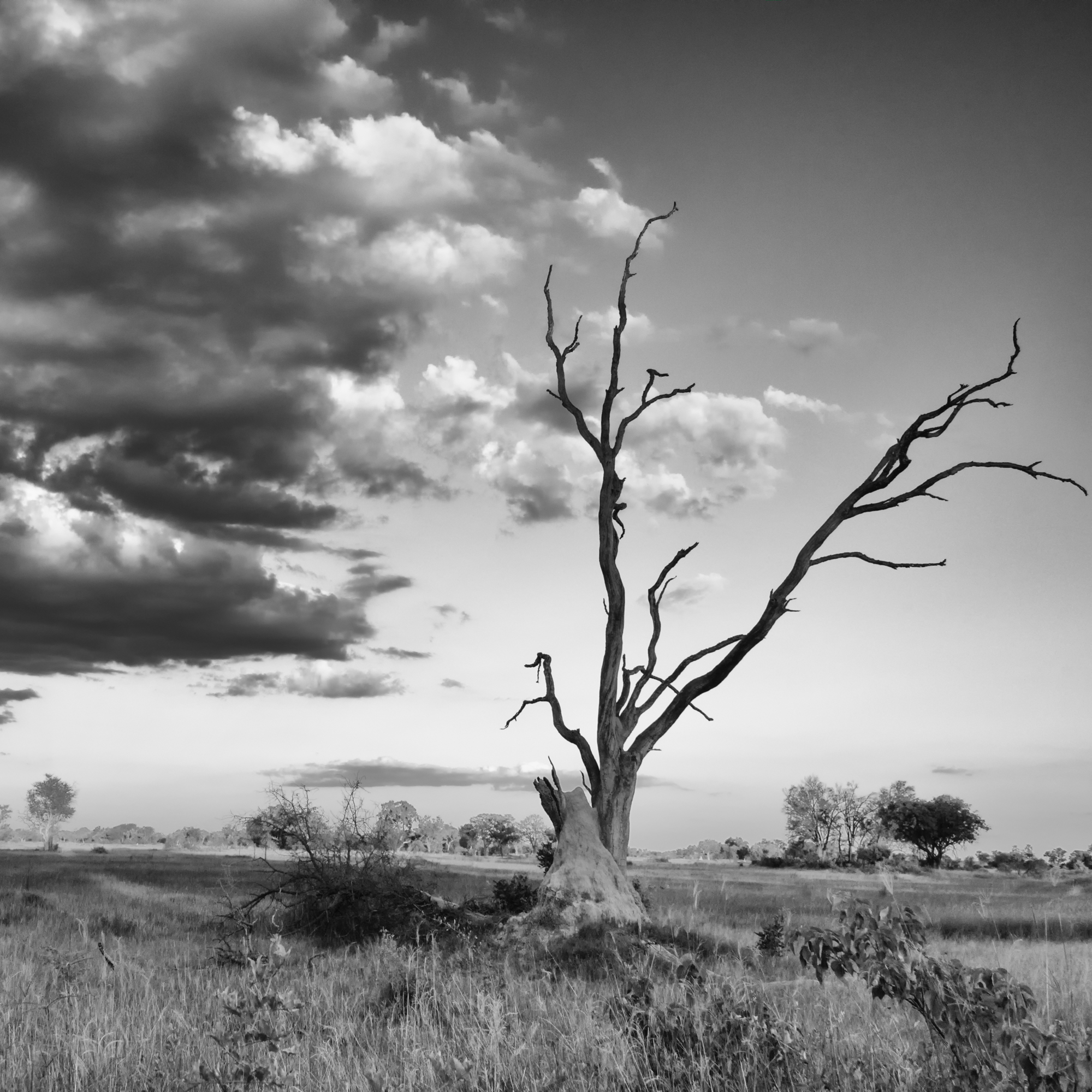
It’s quite nice not having a theme this month, as I can select whatever images catch my attention. Today, it is a selection of images shot at or near sunset.
Wishing everyone a wonderful week ahead.


I’m keeping fingers crossed that I’ll have the opportunity to see lots of big cats while of safari next month. Here are a few images from my previous travels to start the week.
Wishing everyone a fantastic week ahead!


I have not photographed a single sign of spring this week, though I have been enjoying them immensely. I guess in some ways the topic, photographically at least, has been a fail, but it has been making me more aware, and more appreciative of the little signs that spring is on its way.
Today in fact, it really felt as if spring has arrived. Despite the lawn still being covered in snow, it was warm enough to sit on my front porch with an iced coffee and my knitting, and enjoy the warmth of the sun for awhile. Today, that felt a lot more important than rushing around trying to find an image that symbolized the change of seasons.
Instead, here is an image I just finished working on; a 3 shot panorama taken at Phinda Reserve, May 2017. Everyone knows elephants are my favourite, and they are a great stand-in whenever I need an image. This was another moment where sitting and allowing life to unfold was just perfect. Our guide knew the ellies would be heading for the dam, so we drove to it, and just waited. And they arrived shortly after, in groups of 2 and 3, until we had the scene here unfold. And then just as quietly, they all headed back into the bush, to carry on with the day.
Wishing everyone a fantastic week ahead.


Some leopards to start the week! Leopards are definitely my favourite cats to watch (well, at least of the cats I have seen so far… once I have the chance to see tigers and jaguars, I’ll have to revisit this statement!)
The first image was taken in Botswana in the Okavango Delta, in a sighting filled will drama (for the humans involved). Several vehicles from another camp were following this leopard, who was doing what leopards do best, being elusive and sticking to the cover of the bush. There had been a lot of flooding in the area, and a vehicle got stuck while following this cat, and then a second got stuck, trying to help the first. Our awesome ranger saved the day and got the vehicles mobile again, but both stuck vehicles missed out on the few photo opportunities that were available, like this one.

This second image was also from the delta, and I have posted of this sighting many times before so I won’t go on and on. I think though, this shot is how people dream of seeing leopards, but the one above is a far more realistic scenario.

This final image was taken in South Africa; our guide took us to a sighting of a mama leopard and her two cubs in ravine, and we had a brilliant time watching the cubs playing on the fallen trees, scampering through the swamp, and wrestling with each other. The cub pictured here was just about to pounce on its sibling, who was a few feet below on the ground. This was one of those sightings where, as we drove back to camp, our guide told us “we probably should keep this quiet while there are other guests around”.

Just so you know, you can find lots of images like these over in my gallery page!

When I woke up this morning, it was -28C; decidedly not warm here. But the sun is shining, and bundled up, Spencer and I managed a couple of nice walks today. It still doesn’t feel like spring is around the corner; but hopefully that will change soon.
Last week, I flagged several landscape images from my travels for editing throughout the week, and while working on them, I realized that not only do they all fit into the theme of being taken in warm places, but they were all taken on the fly. If I asked guides to stop every time I saw something interesting, we certainly wouldn’t get very far, so I have become rather comfortable with snapping away out of a moving vehicle. Sometimes it works, and sometimes, not so much.
I hope you enjoy my selection of images this week.


Last week I decided that my Sunday posts for the rest of the month would focus on the topic Warm. It seemed fitting, given how cold it has been and how much I wish it would warm up.
Today, I decided to share images that make my heart feel warm and happy. It should be no surprise to any frequent visitor that this means elephants. Lots and lots of elephants!
I hope you enjoy my selections, and wishing you a wonderful week ahead.


